
.png)
Part of my work as a product designer in my current role has been designing analytics dashboards. The company faces a unique challenge: we need to have many different dashboard designs available at all times. We avoid onboarding two partners in close proximity to the same dashboard—something that previously cost us clients when it was noticed. Some of our older dashboards were very outdated, so there was a need for modern, sleek replacements. I’ve created numerous designs now used by our clients, all built in Figma.
Create a new dashboard with the following new features:
The first step in my design process is ensuring that each product has its own dedicated page within the dashboard. These products include CTV, pre-roll, television, and others. A key consideration when designing dashboards is to prevent users from feeling overwhelmed. Many analytics dashboards fail in this regard by presenting data in a disorganized or overly complex manner. The primary issue is the excessive volume of information presented without clear, digestible formatting. For the dashboard below, I focused on structuring the information in a way that enhances clarity and minimizes confusion, incorporating graphs and charts to serve as visual aids for the data.
The design choices were made with the goal of creating a more modern dashboard experience for our clients. This included a dark mode color palette, gradient progress bars, and glass-effect backgrounds for each card. These design elements contribute to a more contemporary feel for the analytics dashboard.
The image below is the overview page of the analytics dashboard I created.
.png)
Designing the logo for Klaus, a YC-backed AI startup, creating a bold, distinctive mark that captures the brand’s personality and establishes the foundation for its visual identity
.png)
Designing an end-to-end TV schedule builder that transforms complex broadcast planning workflows into a fast, intuitive, and scalable product experience for enterprise teams
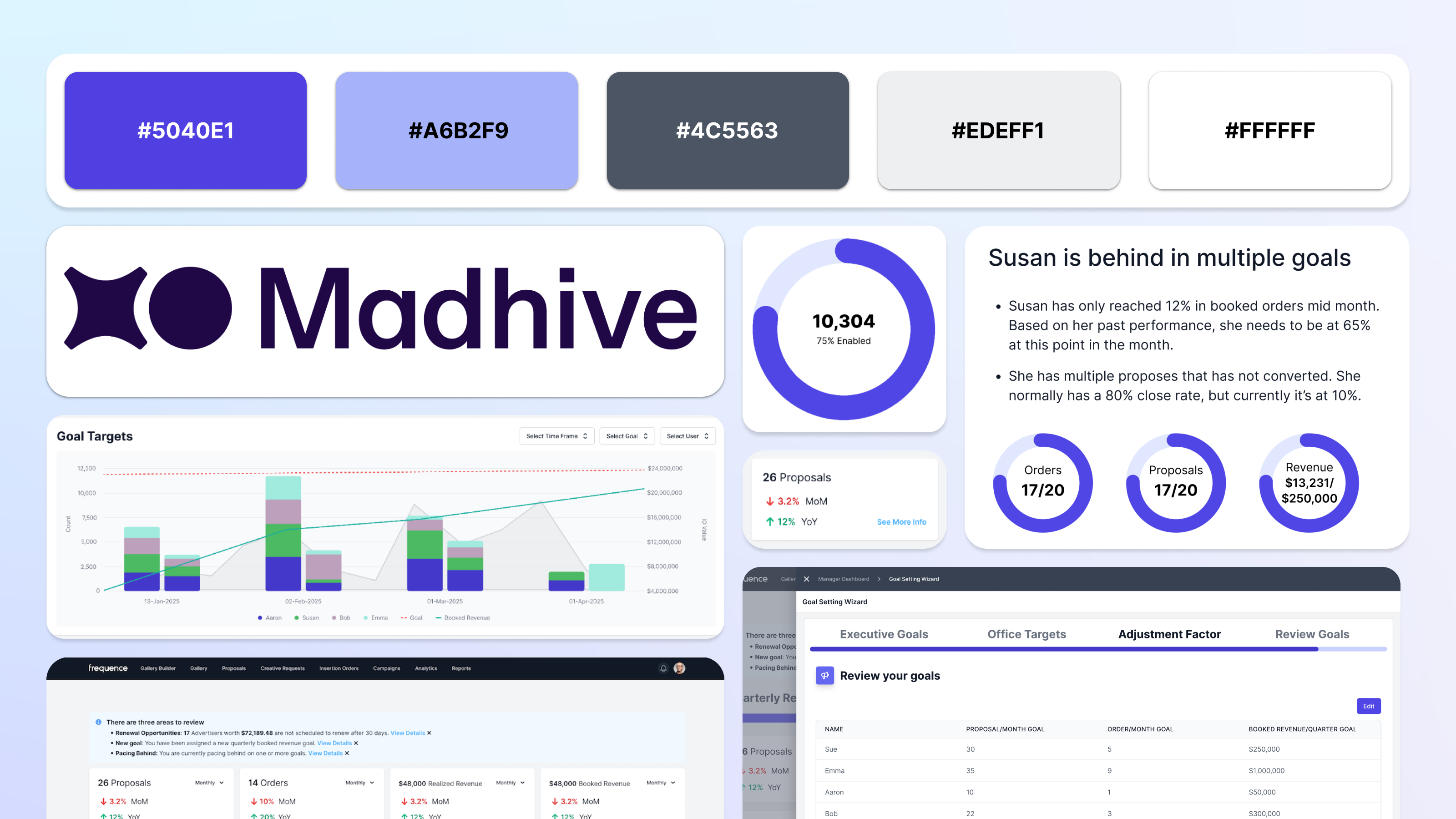
Reimagining sales dashboards with AI-driven insights that help teams identify trends, opportunities, and performance risks
.png)
Re-design for Kaiser Permanente's Dentistry website for their services in the State of Oregon.
Building high-impact analytics dashboards that turn complex advertising metrics into clear, confident decision-making
Re-design for Kaiser Permanente's Dentistry website for their services in the State of Oregon.

Created using Adobe XD, this website prototype informs its users about how to retain their online digital privacy.

A redesign of a website I love (but whose UX constantly pains me) Goodreads.
Designing the logo for Klaus, a YC-backed AI startup, creating a bold, distinctive mark that captures the brand’s personality and establishes the foundation for its visual identity

Graphics I created as a designer for KCPR.org - anything from drawings of coffee to Miley Cyrus.

