
Problem Statement: The Goodreads website lacks a lot of features such as do-not-finish lists, an ability to directly respond to comments, and a favorite books profile, while being outdated, clunky and hard for the user to navigate. The website is losing a lot of potential customers due to its non-user friendly and outdated design. A redesign of the website will not only allow its current users to get a slew of new features they have been asking for for years, but will also bring lots of new users to the website with its new, updated design and more user-friendly experience.
The following project is a redesign of Goodreads.com. The current user interface of Goodreads’ website is outdated and not user-friendly. This project addressed many problems current users complained about the site, and made new designs for each major frame of the site with new fixed features.


When creating a new design guide, I wanted to make the color palette have some of the original tones of the first one, but with some updated flair. The current website lacks an accent color, so I added a pop of coral throughout the website to keep it fun. I also got rid of the serifed font they use currently on the site, as I found it hard to read and a bit outdated.


_Page_1.png)


_Page_6.png)
I had a great time learning how to use Figma and learning more about designing wireframes as a
whole. I really didn’t know a ton about the process before this, and I was lucky that I also happened
to be taking GrC 429 with Professor Yang at the same time as this class. While learning how to
make user personas, high fidelity and low fidelity wireframes, I got to work on my senior project.
That class also taught me how to make design guides, figma basics, user personas, etc. and I ended
up using all of that on my senior project.
1) Gaant Chart
Doing this really helped me lay out everything I needed to do in a timely manner for
my senior project. I tend to get overwhelmed by the task as a whole, so breaking it
down into small parts made the task at hand seem much less daunting.
2) Asking for Help
I ended up meeting with a few Cal Poly graduates who had experience with UI/UX,
and their feedback helped me immensely. I was on a UX fest team with one of them,
and her lessons on Figma and tips for my design really helped me understand what I
could improve.
3) Taking GrC 429 Concurrently
Like I stated earlier, taking this class at the same time as a senior project was
perfect. I was working on two different high fidelity wireframes at the same time,
so while I learned tips and tricks on how to make the one for that class, I could apply
those same tips and tricks to my senior project.
I did get everything done on time, but I was a bit chaotic when it came to getting my work done. I
would have a few two or three chaotic bursts of work, and then not work on it for a while. I ended
up finishing the wireframes early, but my schedule was very chaotic and could have been spread
out a bit better. I also had some trouble with the process book.
Designing the logo for Klaus, a YC-backed AI startup, creating a bold, distinctive mark that captures the brand’s personality and establishes the foundation for its visual identity
.png)
Designing an end-to-end TV schedule builder that transforms complex broadcast planning workflows into a fast, intuitive, and scalable product experience for enterprise teams
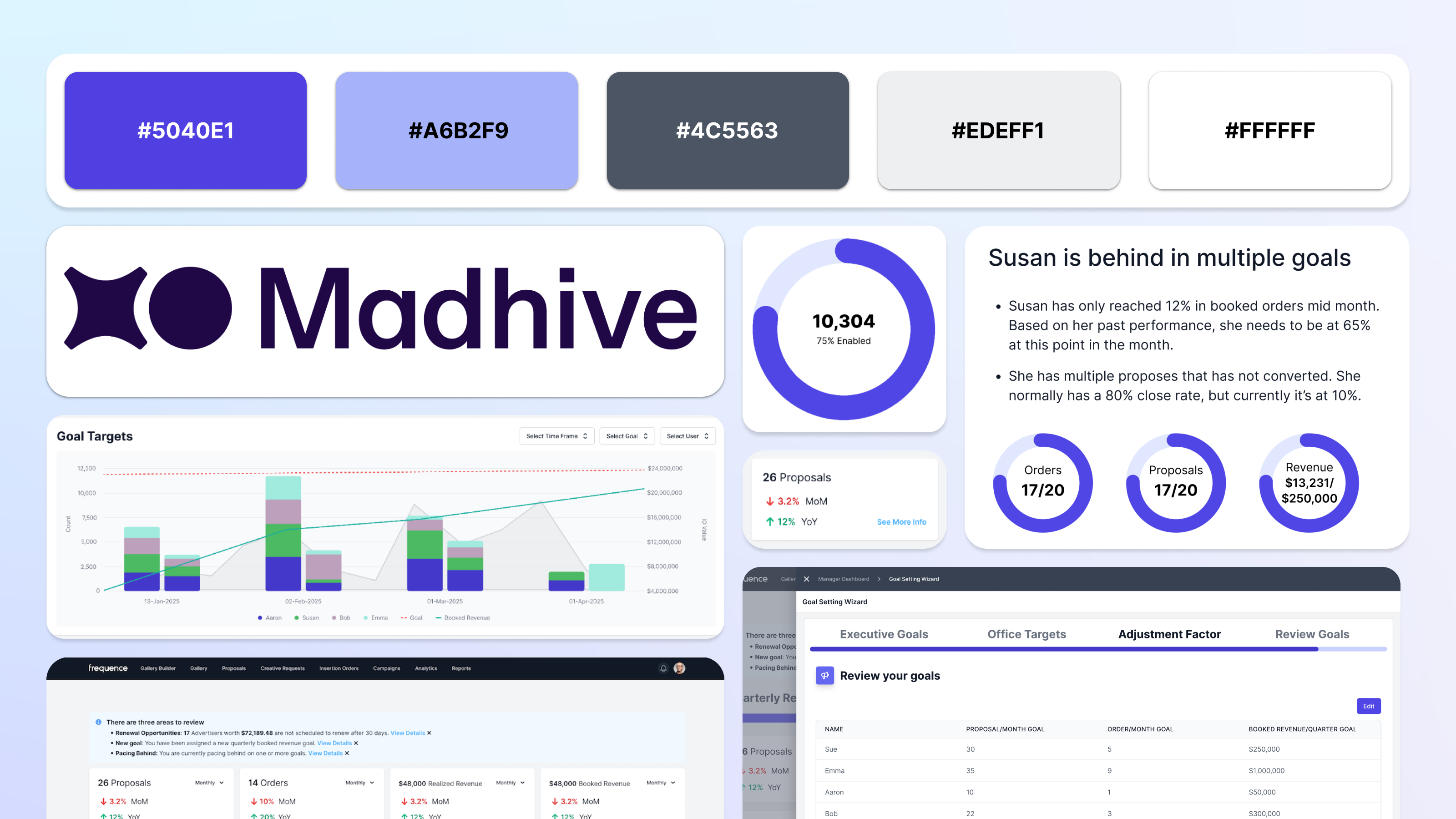
Reimagining sales dashboards with AI-driven insights that help teams identify trends, opportunities, and performance risks
.png)
Building high-impact analytics dashboards that turn complex advertising metrics into clear, confident decision-making
Building high-impact analytics dashboards that turn complex advertising metrics into clear, confident decision-making
.png)
Re-design for Kaiser Permanente's Dentistry website for their services in the State of Oregon.

Created using Adobe XD, this website prototype informs its users about how to retain their online digital privacy.
A redesign of a website I love (but whose UX constantly pains me) Goodreads.
Designing the logo for Klaus, a YC-backed AI startup, creating a bold, distinctive mark that captures the brand’s personality and establishes the foundation for its visual identity

Graphics I created as a designer for KCPR.org - anything from drawings of coffee to Miley Cyrus.

