
1st Place at UX Fest SLO 2022
In February, I was part of a team that created SafeLink as a project for UX Fest Slo, a design challenge based at. California Polytechnic State University, San Luis Obispo. Our idea was to create an app for when you want your friends to know you made it home safe. This could be from work, a party, school, etc. Our design ended up winning first place!
The idea of SafeLink is a mobile application to improve safety measures amongst college students. SafeLink uses GPS and live location technology in order to allow users to share their custom "SafeLinks" with their loved ones. With the live link, friends and family of the user are automatically notified (via app notifications or SMS text) about the status of their loved one en route to their destination.
The mission of this app is to benefits students who feel unsafe while traveling alone and gives peace of mind to those who care about them.
The problem that our team came up to solve was how to make people feel safer navigating campus alone. To come up with a solution, we made a list of problems and solutions that could be solved within our app. We made an affinity map and pooled our own experiences to narrow the solution down to three problem areas and solutions.
To collectively decide on one central idea, we came up with a list of pros/cons for each product and kept the following in mind:
After coming up with these questions, we chose to improve students' safety on/off their campuses through a location-based notification system that connects our users in real time.


To make sure this problem was as prevalent as we thought it was, I conducted white paper research to find statistics on how students feel about campus safety. Some stats I found:
Llc, A. (2021, October 19). Research finds 82 percent of American college students are concerned about their personal safety . GlobeNewswire News Room.
Cal Poly students do not have a system in place to keep track of people going home at night and to let people know where they are.
Grant college students an easy and discrete way to contact emergency resources and loved ones while navigating potentially unsafe situations.
To get in the mind of our different users, we came up with a few different user persona ideas. Our two main personas were the "Chris" persona and the "Jane" persona. These personas would help us focus our decisions around the users’ goals and pain points throughout the development process. These two personas would encompass our two main user types: the friend wanting to track people, and the person who wanted to be tracked.

We had a lot of initial features we wanted to include in the app, as shown on the mind map we created here. We realized that we did not, a) have the time constraints to complete all of this and b) might create cognitive overload for the user. We decided to select a few key features to develop and showcase in our final prototype. Based on our two main personas, we created two user flows to show how each persona might navigate the app. We did so to figure out exactly what features we needed to include, and to put ourselves in the mind of the user. We wanted to be as thorough as possible, so planning out our features through these scenarios would make us include all the necessary features.


We started off by creating a mood board to encompass the sort of design we wanted the app to have. We ended up going with calmer blue tons, as we did not want a safety app to be too overwhelming.

We then made low fidelity wireframes to show the flow of our app and get all of our features down. We wanted to make sure the skeleton of the app was an intuitive as possible before we moved on to the high fidelity wire frames.


We created all the finished screens on Figma. Our presentation and final prototype ended up winning 1st place in the hackathon. Overall, it was a great experience to do a project in such a short amount of time and have such a meaningful and clean result.


Designing the logo for Klaus, a YC-backed AI startup, creating a bold, distinctive mark that captures the brand’s personality and establishes the foundation for its visual identity
.png)
Designing an end-to-end TV schedule builder that transforms complex broadcast planning workflows into a fast, intuitive, and scalable product experience for enterprise teams
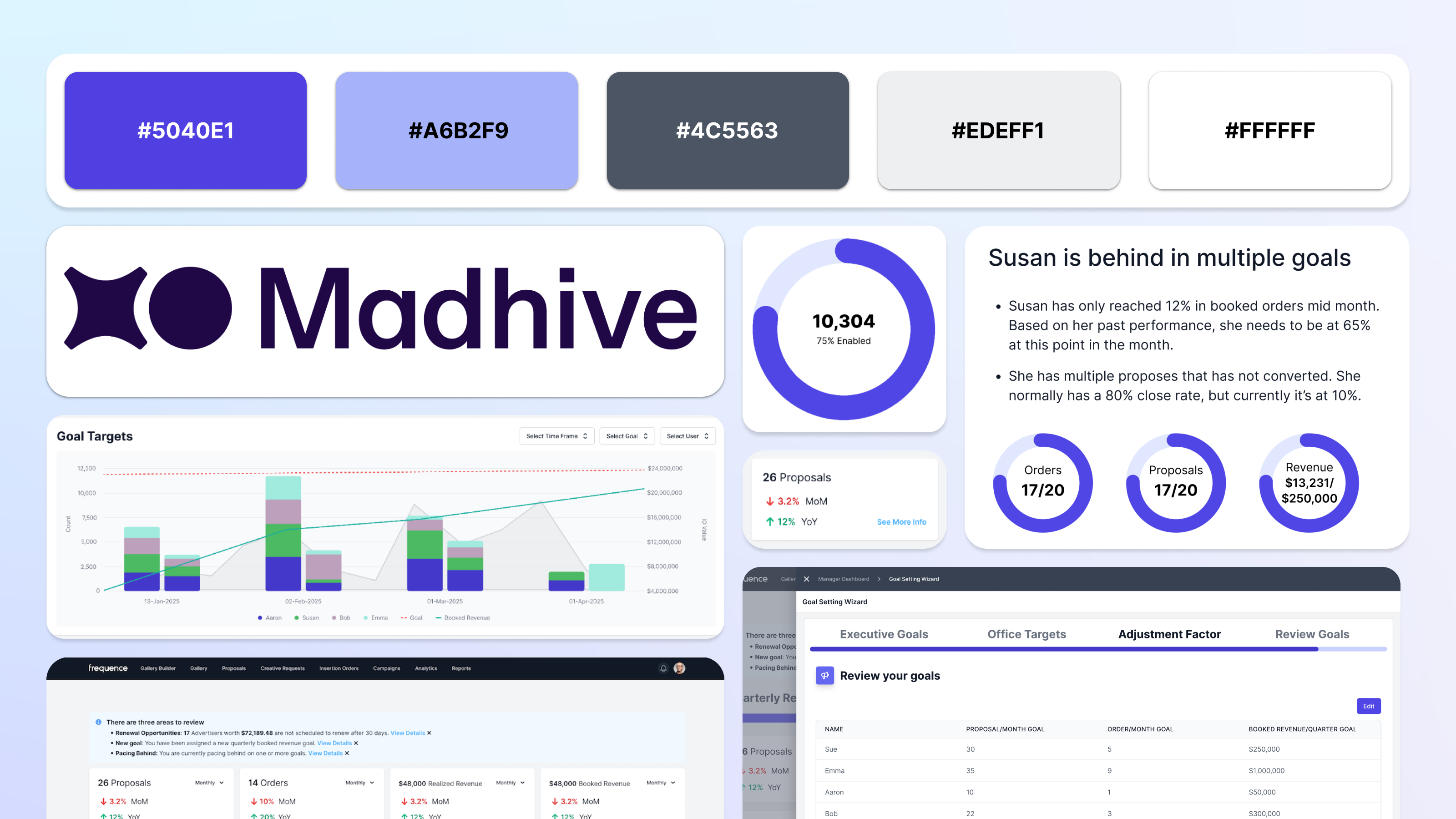
Reimagining sales dashboards with AI-driven insights that help teams identify trends, opportunities, and performance risks
.png)
Building high-impact analytics dashboards that turn complex advertising metrics into clear, confident decision-making
Building high-impact analytics dashboards that turn complex advertising metrics into clear, confident decision-making
.png)
Re-design for Kaiser Permanente's Dentistry website for their services in the State of Oregon.

Created using Adobe XD, this website prototype informs its users about how to retain their online digital privacy.

A redesign of a website I love (but whose UX constantly pains me) Goodreads.
Designing the logo for Klaus, a YC-backed AI startup, creating a bold, distinctive mark that captures the brand’s personality and establishes the foundation for its visual identity

Graphics I created as a designer for KCPR.org - anything from drawings of coffee to Miley Cyrus.
