The sales dashboard is a feature that’s essentially collecting dust. Its outdated interface is neither user-friendly nor visually appealing. The existing metrics lack context and don’t provide users with the insight they need to assess performance trends.
A key part of ensuring the new dashboard included genuinely useful widgets was speaking with people who use our platform daily. In a research session, a customer success manager confirmed that the sales activity dashboard was rarely used because of its clunky design and outdated UI. They emphasized the need for data to be presented in a less text-heavy format and also highlighted the importance of a notification center. This widget could feature ‘areas to review,’ such as renewal opportunities or orders requiring completion.
Looking at Google Analytics, the dashboard had a high bounce rate and low engagement. The core issue wasn’t just visual design - it was that the metrics lacked context. Users were seeing raw numbers, but couldn’t easily answer key questions like:
- "Is this good?"
- "What's changing?"
- "What should I do next?"
As a result, they weren’t using the dashboard to inform decisions.
Our new solution needed to have two key components:
Create a performance dashboard with an updated user interface and more insightful metrics. The dashboard should also include more visual elements and be less text-heavy. Additionally, a notification center will be included to display important alerts for the user to review.
.png)
The initial bulk of the work involved removing sections that were no longer useful. After that, I updated the remaining content to align with the platform's design system.

I then returned to the wireframes and added a new notification center for users. I also increased the size of the headers and text to improve legibility on such a content-dense page. The final component the team decided to add was a benchmark comparison feature, which allows users to set sales goals for the company, individual salespeople, and more.

The final version was well received by users, leading to a significant increase in traffic compared to the previous design. Average daily usage of the sales dashboard tripled, with 30% user adoption within the first month of launch. Additionally, participants saw a 20% quarter-over-quarter increase in revenue.
This project reinforced for me that good product design isn’t just about presenting data, it’s about turning information into actionable insight.
After the success of V.1, the team realized that are more features that would be beneficial to the sales dashboard platform. Although the new metrics design was easier to view, it still lacked the depth needed to provide users with meaningful insights. The dashboard also did not include a system for setting or managing goals.
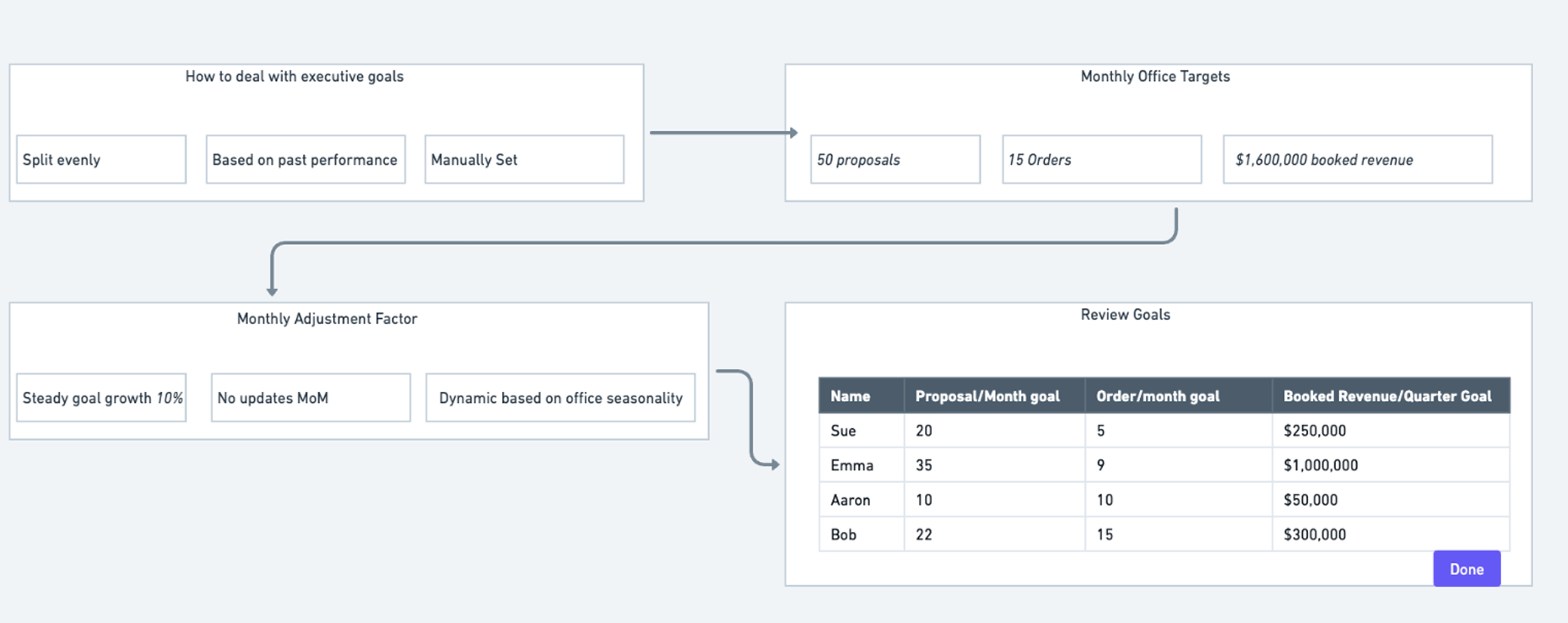
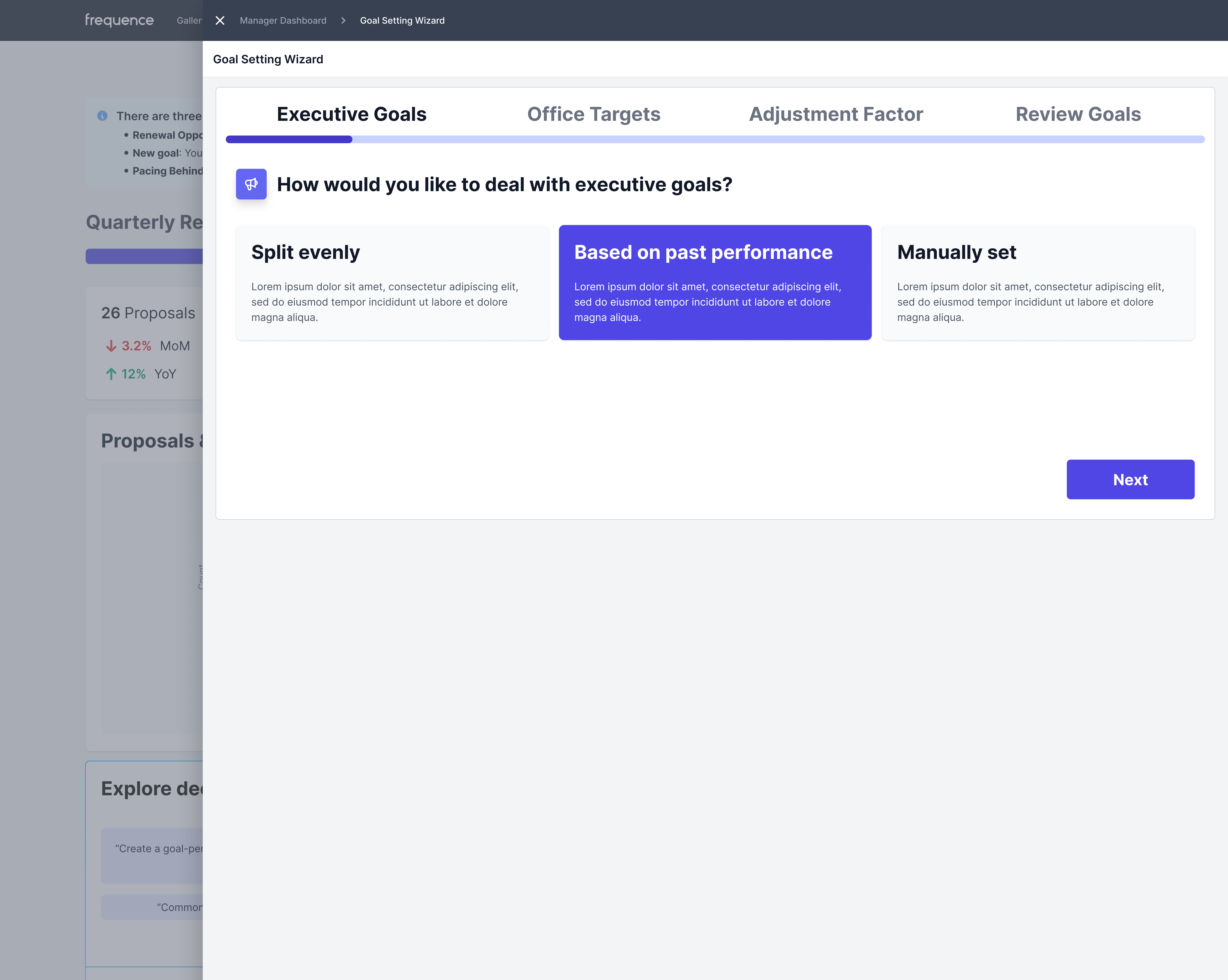
We decided to enhance the feature by adding a goal-setting wizard, customizable views for different users and personas, the ability for users to prompt AI for sales insights.
A PM and I began by brainstorming what this goal-setting dashboard would look like and what it could accomplish. The goal-setting wizard would be used to set goals for employees, establish monthly office targets, and more.
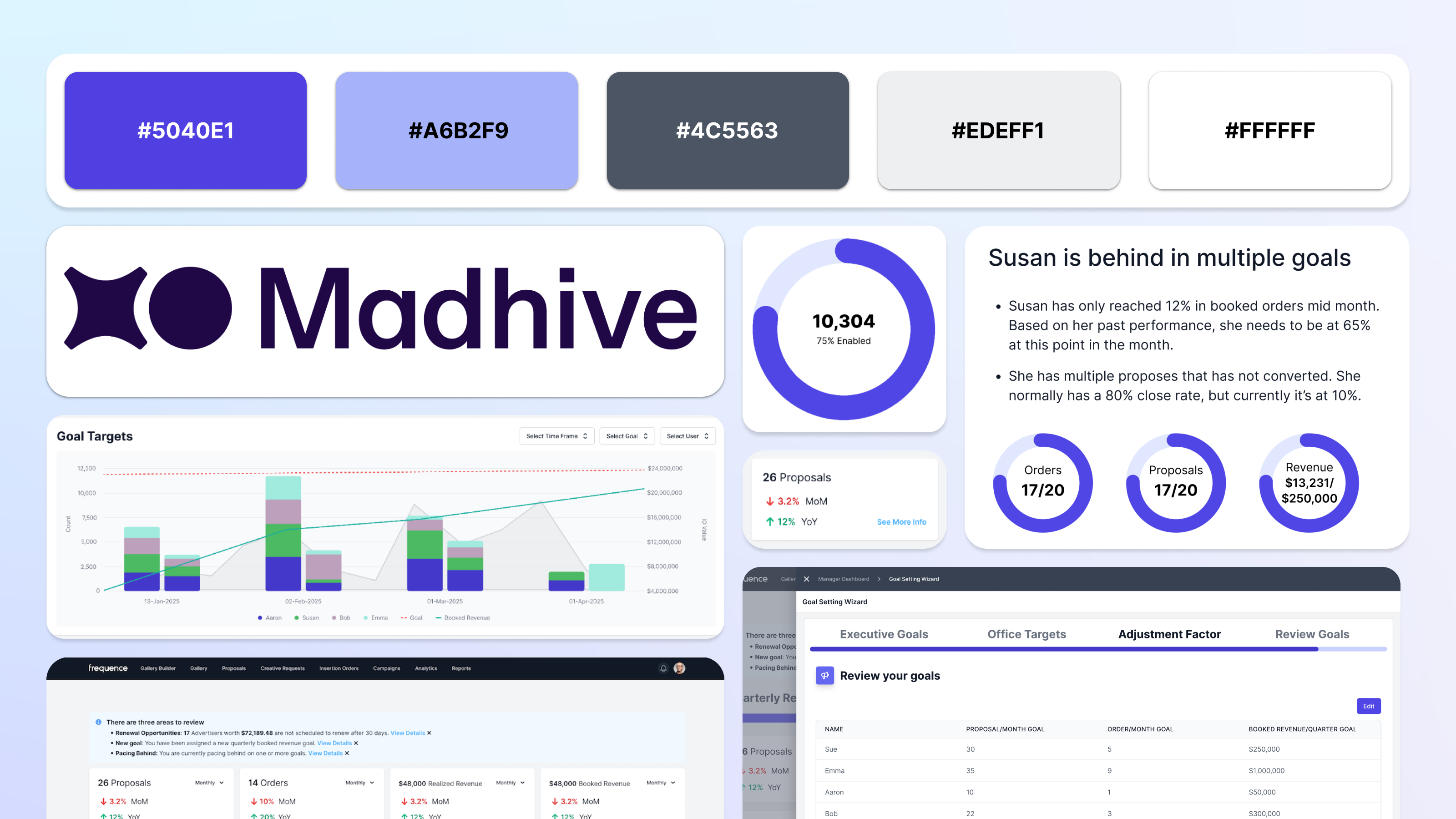
Create a sales dashboard that allows managers and executives to set goals, monitor team progress, and ensure their teams are meeting performance standards. Integrate AI-generated insights and analysis of sales.
New landing page: managers and executives see updated dashboards
Notifications: highlight new goals and progress risks
Cards: high-level team/market metrics
Graphs: show progress against monthly and quarterly goals
Goal setting drawer: access to current and historical goals
Goals overview widget: tracks team progress and flags risk
AE goal widget: replies benchmark view with goal status
I began by creating low-fidelity wireframes outlining the features for each major user’s dashboard. A new feature added for every user was a sales metrics section at the top of the dashboard, highlighting the number of proposals and orders the team had generated, along with metrics for realized and booked revenue. We also introduced a new AI chat feature, allowing users to prompt the AI to perform various tasks, such as creating a goal-performance graph or generating a table showing AE performance for the current quarter. The tables from the previous version of the sales dashboard were included at the bottom of the page, as we wanted to include the flashier, more engaging graphics at the top of the dashboard.
The integration of AI makes the sales dashboard more interactive and engaging. AI-generated team member reviews, designed to be succinct and timely, provide users with richer insights. The addition of visually appealing data charts creates a more engaging experience upon landing, avoiding the overwhelm of data-heavy tables. The updated design also introduces more meaningful metrics, offering users better insights. Overall, the AI integration makes the second version of the sales dashboard significantly more useful and interactive.
Designing the logo for Klaus, a YC-backed AI startup, creating a bold, distinctive mark that captures the brand’s personality and establishes the foundation for its visual identity
.png)
Designing an end-to-end TV schedule builder that transforms complex broadcast planning workflows into a fast, intuitive, and scalable product experience for enterprise teams
.png)
Building high-impact analytics dashboards that turn complex advertising metrics into clear, confident decision-making
.png)
Re-design for Kaiser Permanente's Dentistry website for their services in the State of Oregon.
Building high-impact analytics dashboards that turn complex advertising metrics into clear, confident decision-making
Re-design for Kaiser Permanente's Dentistry website for their services in the State of Oregon.

Created using Adobe XD, this website prototype informs its users about how to retain their online digital privacy.

A redesign of a website I love (but whose UX constantly pains me) Goodreads.
Designing the logo for Klaus, a YC-backed AI startup, creating a bold, distinctive mark that captures the brand’s personality and establishes the foundation for its visual identity

Graphics I created as a designer for KCPR.org - anything from drawings of coffee to Miley Cyrus.

